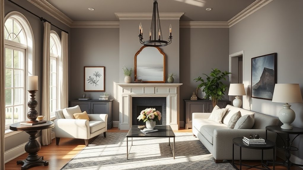
Did you know that the right light wall paint can greatly affect your mood and perception of space? Many people underestimate how color influences the ambiance of their home. When you're looking to brighten up your rooms, you'll want to take into account a variety of shades that not only enhance the natural light but also create a welcoming atmosphere. As you explore options, you might be surprised by which colors resonate with you and how they can transform your living environment. What are the top choices that could elevate your home's appeal?
Essential Insights
- Warm Whites: Consider shades like Sherwin Williams Alabaster and Benjamin Moore Ballet White for a cozy and inviting atmosphere in any room.
- Soft and Muted Colors: Benjamin Moore First Light and Revere Pewter offer gentle tones that create a serene and balanced environment.
- Calming Blues: Nippon Paint's Blue Wool and Sherwin-Williams Open Seas provide tranquil vibes, perfect for bedrooms and relaxation spaces.
- Bright Yellows: Farrow & Ball Sudbury Yellow brings cheerful warmth and brightness to your home, especially in well-lit areas.
- Versatility: Colors like Revere Pewter adapt well to various decor styles, enhancing aesthetics while complementing a wide range of palettes.
Sherwin Williams Alabaster

When it comes to choosing a wall paint color, Sherwin-Williams Alabaster stands out as a warm white that brings a cozy feel to any space. Its strong yellow undertones create an inviting atmosphere, making it a perfect choice for low-light rooms.
With a Light Reflectance Value (LRV) of 82, it reflects a significant amount of light, ensuring your space feels bright, yet it's not overly stark like some cleaner whites. Its versatility contributes to widespread acclaim, making it ideal for dark rooms while maintaining brightness without harshness.
Alabaster's color versatility allows it to seamlessly blend with various decor styles. You can use it on walls, trim, or even kitchen cabinets, where it adds warmth to classic white kitchens, especially when paired with granite or quartz countertops.
It works harmoniously with dark gray and earth tones, creating a balanced palette. However, keep in mind that it contrasts beautifully with crisp white trims like SW Extra White, emphasizing its warmth.
While Alabaster's yellow and beige/greige undertones may make it less flexible in mixing with other whites, its charm lies in its ability to complement a range of colors. This quality makes it a go-to for various rooms, including living rooms and dining areas.
Whether you're in a home with shady spots or just looking to create a welcoming vibe, Alabaster's unique attributes make it a standout choice for your next painting project.
Benjamin Moore Classic Gray

Benjamin Moore Classic Gray is an ultra-light shade that effortlessly straddles the line between gray and off-white, making it a versatile choice for any space. This warm gray features soft, muted undertones, including subtle hints of green, violet, and pink.
The beauty of Classic Gray lies in its color versatility; it adapts beautifully to different environments, influenced by the room's lighting and surrounding finishes. Notably, its classification as a warm gray allows it to create a balanced and inviting atmosphere.
With a Light Reflectance Value (LRV) of 73.67 to 74.8, Classic Gray reflects a significant amount of light, giving it a bright and airy feel. However, in super bright rooms, it may wash out, so it's best suited for medium-lit areas where its true character shines. Depending on the lighting, it can appear almost white in well-lit spaces while taking on a soft gray tone in darker rooms.
This color is perfect for a whole-house palette, as it works harmoniously in any room, regardless of exposure—North, South, East, or West. It pairs well with various decor styles, furniture, and flooring, making it a dream for homeowners looking for a neutral backdrop.
Additionally, it complements trim and accent colors like Chantilly Lace and Metropolis, enhancing the overall aesthetic without overwhelming the space.
Choose Benjamin Moore Classic Gray for a timeless, adaptable look that elevates your home's interior effortlessly.
Nippon Paint's Whispering White

Nippon Paint's Whispering White offers a revitalizing alternative to more traditional light wall colors. This very light shade of white, with a subtle yellow undertone, is part of Nippon Paint's classic whites collection and brings warmth to any space.
Here are some compelling reasons to evaluate Whispering White for your home:
- Excellent stain washability: Easy to clean, making it ideal for busy households.
- Low odour during application: You won't have to endure strong fumes while painting.
- Non-toxic composition: Safe for indoor use, free from lead, mercury, and heavy metals.
- Anti-fungus property: Promotes a clean, fresh environment.
When it comes to Whispering White applications, this versatile color suits various rooms, including your living room, bedroom, dining area, study, kid's room, and kitchen. Additionally, its spot-less technology minimizes stains and marks, ensuring a pristine finish.
You'll find that it enhances the overall appearance of your walls while providing long-lasting colors. Plus, it's available in an 18L size, perfect for larger projects.
One of the standout Whispering White benefits is its excellent water resistance, making it a practical choice for areas prone to moisture.
For added creativity, consider pairing it with Momento Special Effect Paint for a unique touch. It's advisable to refer to a Nippon Paint color brochure for the best color match and visualize your ideas online.
With Whispering White, you're not just painting; you're transforming your home into a haven of light and comfort.
Benjamin Moore First Light

One of the most charming light wall colors you can choose is First Light by Benjamin Moore. This soft, airy pink not only creates a serene atmosphere but also taps into the principles of color psychology, evoking feelings of calmness and warmth.
With a Light Reflectance Value (LRV) of 75.86, it reflects plenty of light, making your spaces feel bright and inviting. First Light is Benjamin Moore's 2020 Color of the Year, adding a trendy touch to your home decor.
When considering paint application, First Light shines in various room orientations—north-facing, south-facing, east-facing, or west-facing. It remains lively and vibrant, even in low-light areas or windowless rooms.
For the best results, pair it with crisp whites or off-whites for your trim and ceiling, allowing the pink to take center stage. Complementary colors like soft greens and blue-greens, such as Benjamin Moore Mt. Saint Anne, enhance its charm beautifully.
Avoid using First Light as an accent wall in mainly white rooms, as it may not provide the contrast you desire. Instead, think about repeating the color in your decor items like throw pillows or artwork to create a cohesive look.
For a flawless finish, apply it with Benjamin Moore's premium paints available in various finishes, including flat and eggshell.
Before you commit, always test First Light in your space. It's all about ensuring this lovely pink feels right in your home, offering you a revitalizing alternative to traditional whites and beiges.
Benjamin Moore Revere Pewter
When you're looking for a versatile light wall color, Revere Pewter by Benjamin Moore stands out as an ideal choice. This warm gray, with its subtle greige appearance, adapts beautifully to varying lighting conditions, making it a favorite among homeowners.
Here are a few reasons why you should consider it:
- Warm undertones: Its primary green undertones may shift to blues or pewter depending on the light.
- Ideal for multiple spaces: Works wonderfully in living rooms, kitchens, and open-concept areas.
- Reflective: With an LRV of 55.05-55.77, it provides just the right amount of light without being too stark.
- Perfect pair: Complements dark blues, teals, and neutral shades effortlessly.
As you explore Revere Pewter trends, you'll find it pairs well with various colors. For instance, dark blues like BM Polo Blue create a stunning contrast, while earthy beiges like Manchester Tan offer a warm, cohesive look.
It also works seamlessly with clean whites, such as Benjamin Moore White Dove, ensuring an inviting atmosphere.
When using Revere Pewter, remember to test samples in your space first. Its appearance can change dramatically based on lighting.
This timeless color not only enhances your home's aesthetic but also serves as a solid foundation for your design vision. Embrace the versatility of Revere Pewter combinations to create an inviting and harmonious living environment.
Nippon Paint's Blue Wool

If you're exploring light wall colors that evoke a sense of calm and relaxation, Blue Wool offers a rejuvenating alternative to Revere Pewter. This soft, calming blue hue from Nippon Paint is classified as a light shade of cyan, making it perfect for various spaces in your home. With its calming color psychology, Blue Wool can help create a tranquil atmosphere while also stimulating productivity and creativity.
Here's how you can use Blue Wool in different areas of your home:
| Room Type | Effect of Blue Wool |
|---|---|
| Living Room | Creates a welcoming and serene environment |
| Bedroom | Enhances relaxation and restful sleep |
| Study Room | Boosts focus and enhances thought processes |
| Kids' Room | Stimulates creativity while remaining calming |
Nippon Paint's versatility allows you to choose from various finishes, whether you prefer a smooth sheen or a matte look. It's suitable for both residential and commercial projects, making it an ideal choice for any setting. You'll find Blue Wool available in 5L quantities, perfect for extensive painting needs.
For accurate representation, always refer to a Nippon Paint color brochure, as screen variations can affect the color appearance. You can easily purchase Blue Wool online or through authorized retail shops, often with promotional discounts available. With this color, you can transform your space into a haven of tranquility and focus.
Farrow & Ball Sudbury Yellow

Farrow & Ball Sudbury Yellow brings a cheerful warmth to any space, making it an excellent choice for those looking to brighten up their home. Named after the staircase at Sudbury Hall, this traditional mid-yellow shade is known for its remarkable color versatility and responsiveness to changes in light.
Whether you're painting a hallway, living room, or playroom, Sudbury Yellow can create a welcoming atmosphere.
Here are some key features of this vibrant hue:
- Appears cleaner and brighter in well-lit rooms.
- Softens in dimly lit spaces, adding a cozy feel.
- Pairs beautifully with complementary whites like White Tie.
- Works well with stronger contrast colors such as New White.
One of the standout qualities of Sudbury Yellow is its interaction with lighting effects. In brighter areas, it exudes a lively brilliance, while in dimmer settings, it provides a gentle, warm glow.
This makes it perfect for full-room transformations or accent walls, allowing you to customize the mood of a space effortlessly.
Available in various finishes—including Dead Flat, Modern Emulsion, and Estate Emulsion—you can choose the level of sheen that best suits your needs.
For exterior use, the Exterior Masonry option guarantees long-lasting durability and resistance to weather conditions.
Before diving into your project, consider testing the color with sample pots to see how it reflects in your specific lighting conditions.
Sherwin-Williams Open Seas

Serenity defines Sherwin-Williams Open Seas, a tranquil blue hue that effortlessly infuses spaces with a calming optimism. This beautiful color belongs to the blue family and features cool teal undertones, making it a perfect choice for anyone looking to create a peaceful ambiance.
With a Light Reflective Value (LRV) of 38.92, Open Seas reflects just enough light to brighten your space without overwhelming it.
Incorporating this color into your home taps into color psychology, evoking feelings of tranquility and relaxation. It's especially suitable for bedrooms, where you want to cultivate an untroubled atmosphere.
Imagine waking up in a space painted with Open Seas, surrounded by a calming coastal theme that transports you to serene shorelines.
Open Seas isn't just limited to indoor spaces; it also works wonders for exterior projects, inviting a rejuvenating coastal vibe to your home's facade.
As part of the Color Pizzazz collection, it provides ample inspiration for various design projects, blending seamlessly with other hues to create stunning palettes.
If you're unsure about how Open Seas will look in your space, Sherwin-Williams offers peel & stick paint samples for easy testing.
You can also get expert advice through their virtual consultations.
Share your color experiences on social media with #SWColorLove to inspire others. Open Seas could be the perfect addition to bring a sense of calm and optimism to your home.
Benjamin Moore Ballet White

Bringing warmth and elegance to any space, Benjamin Moore Ballet White is an off-white shade that boasts a complex, nuanced profile. This color features subtle undertones of cream, greige, and the palest creamy yellow, ensuring it remains neutral without a strong yellow cast.
With a Light Reflectance Value (LRV) of 71.97, Ballet White reflects a moderate amount of light, making it versatile for various Ballet White applications.
Consider these key features:
- Warmth & Neutrality: Perfect for creating a cozy atmosphere.
- Natural Light: Looks lighter in sunny spaces, ideal for south-facing rooms.
- Contrast Options: Works beautifully with white trims for a sophisticated finish.
- Architectural Compatibility: Suits traditional and classic home styles.
When it comes to Ballet White lighting, the shade adapts remarkably well depending on the room's orientation. In south-facing areas, it radiates warmth, while in north-facing rooms, it may show cooler undertones.
This quality makes it a fantastic choice for bedrooms, creating a calming ambiance, and for living rooms, where it adds a touch of elegance.
Ballet White pairs well with bright accent colors like apple green and coral, as well as earthy tones and dark colors like Kendall Charcoal.
Whether you're painting walls, trim, or kitchen cabinets, Ballet White stands out as a versatile option that enhances any environment. Embrace this elegant shade for a timeless look in your home.
Benjamin Moore Blue Danube

Benjamin Moore Blue Danube offers an attractive, teal-toned blue that can transform your space into a haven of elegance or a bold statement. With its LRV (Light Reflectance Value) of 11.18, this color doesn't just sit passively on the walls; it actively influences the room ambiance.
When you choose Blue Danube, you tap into the principles of color psychology, where blues are known to evoke calmness and tranquility, making it ideal for spaces where relaxation is key.
This versatile shade fits seamlessly with various decorating styles, from classic to contemporary. Pair it with Chantilly Lace or Wedding Veil for a crisp, fresh look, or combine it with Hazy Skies for a serene, coastal vibe.
If you're feeling adventurous, consider using Gentleman's Gray alongside Blue Danube to create a sophisticated contrast.
The different shades within the same family, like Harbor Fog and Blue Hydrangea, can add depth to your design. You can even incorporate similar colors, such as Summer Nights or Bermuda Blue, to create a dynamic, layered effect that keeps your space feeling vibrant yet cohesive.
Ultimately, whether you want to create a soothing retreat or a chic focal point, Benjamin Moore Blue Danube is a perfect choice. It not only enhances the aesthetics of your home but also resonates with your emotional well-being, ensuring your space feels just right.
Frequently Asked Questions
What Lighting Works Best With Light Wall Paint Colors?
When it comes to lighting, you'll want to strike the right balance.
Natural light works wonders on light wall colors, enhancing brightness and making your space feel airy.
On the flip side, artificial light, especially warm white bulbs, can complement those hues beautifully.
Mixing various light sources creates depth, while dimmable options allow you to adjust the ambiance.
How Do I Choose the Right Undertone for My Space?
To choose the right undertone for your space, start by considering color theory.
Look at the existing furniture and decor to find shades that complement or contrast nicely.
Think about the mood enhancement you want—cool undertones create calm, while warm tones bring energy.
Test samples in different light to see how they interact throughout the day.
This way, you'll achieve a harmonious ambiance that reflects your personal style and enhances the room's atmosphere.
Can I Use Multiple Light Colors in One Room?
Yes, you can definitely use multiple light colors in one room!
Think light grey with soft lavender, light blue with bright white, or light peach against neutral tones. These color combinations add depth and create a serene atmosphere.
Consider adding accent walls to highlight your favorite shades and draw attention to unique features.
What Are the Best Finishes for Light Wall Paints?
When choosing finishes for light wall paints, consider the satin and eggshell finishes.
Satin finish offers a moderate sheen, making it easy to clean and perfect for high-traffic areas. It enhances brightness while resisting scuffs, ideal for families.
On the other hand, eggshell finish provides a subtle sheen that's easier to clean than flat finishes, making it suitable for most interior walls.
Both options effectively hide imperfections while adding a polished look to your space.
How Can I Make Light Colors Pop in a Small Room?
To make light colors pop in a small room, you can use color contrast effectively.
Incorporate accent decor like bold cushions, vibrant artwork, or striking furniture to create visual interest. Choose darker shades for your accents to emphasize the light walls.
Additionally, consider painting one wall a deeper hue for a dramatic focal point, which will enhance the airy feel while making the lighter colors stand out even more.